|
| Of course we’re authentically Asian! We have lanterns! |
It seems far easier to begin and then to maintain any kind of a business here in Berlin, which I assume is mostly down to the whole rule of it being ‘arm aber sexy’ (arm means poor, not an actual arm). If you are just a simple guy with an idea, fifty euros and a pocketful of dreams you will probably be able to fulfil your ambition of owning a vaguely profitable kebab shop, bakery, dodgy Spätkauf, all-polyester clothing shop etc and keeping it on its vaguely wobbly legs for a good year or two before it joins the ranks of the permanently dark and dusty voids that pepper the streets of Berlin like rotten teeth in a pirate’s mouth.
This is brilliant and one of the things I adore about Berlin, because in the UK you now have to be Sir Alan Sugar or a man of his means and arsehole qualities in order to be able to start any kind of independent operation that is not going to go belly-up within months. This has resulted in the renowned problem that the only people who can afford to pay rent for a shopfront or are able to maintain a business are those who already have huge corporate money machines and therefore every city in the UK is now identical to every other city, boasting exactly the same shops simply in a slightly different sequence. Every company has the same Helvetica font and three-circles-inside-eachother logo because most of the successful corporate graphic designers are just as monotonous as the companies and the shopfronts and the fonts themselves. In comparison, Berlin looks like a complete mess, and it is fantastic.
Nonetheless, it does slightly worry me that these bright-eyed ambitious entrepreneurs who found and run all these establishments or franchises at no point seem to take the moment to think: “Hey now, hold on a sec, why doesn’t my shop look as cool and shiny and non-food-poisoning-y as H&M’s or Rossmann’s or MediMax? I spent a good half-hour with WordArt to make my shop sign, that’s got to count for something…” Walking around Berlin I am aghast at the parade of atrocious shop design. The sheer number of ‘Asia Woks’ and ‘Asia Boxes’ and ‘Asia Snacks’ and ‘Curry Asia’ and ‘Asia Chunk’ and ‘I can’t believe it’s not Asia’ is a good example. Why should this concept of a generic Asia which when you look at the menu seems to encompass exclusively China and Vietnam be a crowd-puller, why as an Asian person would you choose to make your shop so reductive of the richness of your own cultural background and why oh why oh why would you choose such racist and abysmally ugly fonts as the frontispiece to a business that you would like to be taken seriously? Why don’t these guys ever realise that no successful business has ever won customers by pummelling the theme of their enterprise directly into the retinas of the populace; you would certainly never get a chain of successful New Orleans soul-food restaurants with a horrendous stereotype honky-tonk black person’s face as the logo (although Old Orleans was always teasingly close to being offensive on that score) and KFC is never going to change its name to ‘Redneck Chow’.
Ultimately the issue here is that the customer (well, me) looks at these things and sees the font and the logo and thinks ‘oo-err, I’m not going to risk that’. There is an array of visual cues I use to direct me in what to avoid on a daily basis: never buy from a website or shop, for example, that ever uses Comic Sans (“Ooh look Hans, this font is fun because it looks a bit like something from the cartoons we used to never read – let’s use it because it says we are wacky and fun.”), and never from anywhere that uses clipart as part of their iconography. I will always be put off by WordArt and drop shadows, and when I saw that James Cameron had decided to use Papyrus as his typeface of choice for the Avatar subtitles I almost choked on my own epiglottis with the sheer extremity of my incredulous rage. Come on, James Cameron, you can spend billions of dollars on a hackneyed jungle-book-meet-the-blue-man-group epic but you are too tight to splash a couple of bucks on a slightly less MSWord-default font? Oh wait, sorry, Papyrus looks ‘ethnic’, I forgot.
So I beg you, entrepreneurs of Berlin, please explain this to me: why don’t you see how bad your projects look to the person potentially giving you their money? Why do you think it is enough to draw a logo in felt tip pen, take a photo of the drawing and print the photo on your letterhead for evermore? Do you think it looks just as sexy and professional as SmithKlineBeecham to use an eye-watering rainbow gradient as the background to your website? And don’t you ever ask yourself why you have never been to a successful chain which had any or one of these same qualities?
The exception to the rule: a mountainside cafe which we frequented often in Obertauern was always thronging with customers and utterly lovely to be in as it was full of gorgeous old wood and antique snowshoes and such like; this all in despite of the fact that their chosen logo was, inexplicably, a sunglass-wearing cool-dude hare snowboarding WHILST having arrogant sex with a slutty female hare on the same snowboard at presumably break-neck speed (you can tell from the way their ears are fluttering).
 |
|||||||
| Really? |
The poor staff had to wear uniforms emblazoned with this terrible image.
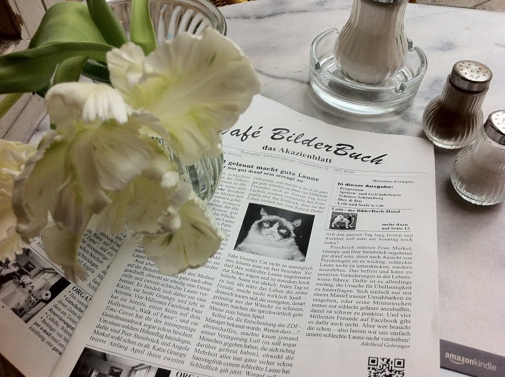
But while we are on the subject of eateries, allow me to offer a few more suggestions that you might also like to take on board if you ever feel like opening an establishment and want me to spend my hard-earned cash there. For starters, bullet points belong on Powerpoint presentations and not the menu. As a colleague of mine pointed out, plastic chairs are a one-way ticket to me walking in and then directly back out of your door. If you think that having dark and far-too-yellow photographs of your meals on the menu is going to make my mouth water, think again; you don’t even seem to have made an effort to stop each and every dish looking like a mountain of puke. Let me at least imagine a beautiful plate of delicious ingredients tossed expertly together before I am presented with my vomcano. And hey, I know grains of rice in the salt shaker keep the salt from clumping but don’t you think they do look a little bit (read: a lot) like dead maggots floating around among the salt crystals?
Perhaps I am the only person in the world who thinks these things; perhaps the fact that I allow these visual signs to govern my spending behaviour is a simple sign of the my utter Woody Allen-level neuroticism in that I can’t see any of these various clues without thinking ‘these people are going to steal my money or give me salmonella’. But I wouldn’t want to trust my digestive health to the same people who don’t understand the fundamental drop-dead ugliness of WordArt. These people, in my opinion, should not even be allowed near knives and other dangerous kitchen equipment.