Good afternoon.
I say ‘Good afternoon’ because I get the sense that you lot are not the kind of people who are used to getting up early.
Back in olden times, people used to use things like alarm clock radios or Teasmades or even those ones with the bells on top to make sure they would wake up early in the morning in time to get ready for work and feed the chickens, or whatever it was they needed to do which was counter to their innate biological instincts. But things have changed, and now almost everyone uses the alarm on their phone. Even I, who used to be dedicated to her alarm clock radio. There’s something about waking up to the news and being infused with a crashing existential terror about the future of the planet before one has even dried one’s hair.
Needless to say, the alarm app on one’s phone is probably one of the most important features it has. People may buy their smartphone for the sick features and the thrill of having a lump that costs one month’s salary casually knestled in their coat pocket, but what they can’t do without is the everyday stuff that genuinely affects one’s ability to move through the world. We need a map-like thing to help us get places; we need soft- and hardware that enables us to communicate in real-time; we need a way to scan QR codes in the three remaining restaurants that still insist on making you do that to see the menu. And the alarm clock is the most basic thing, the thing that we need most of all.
And yet.
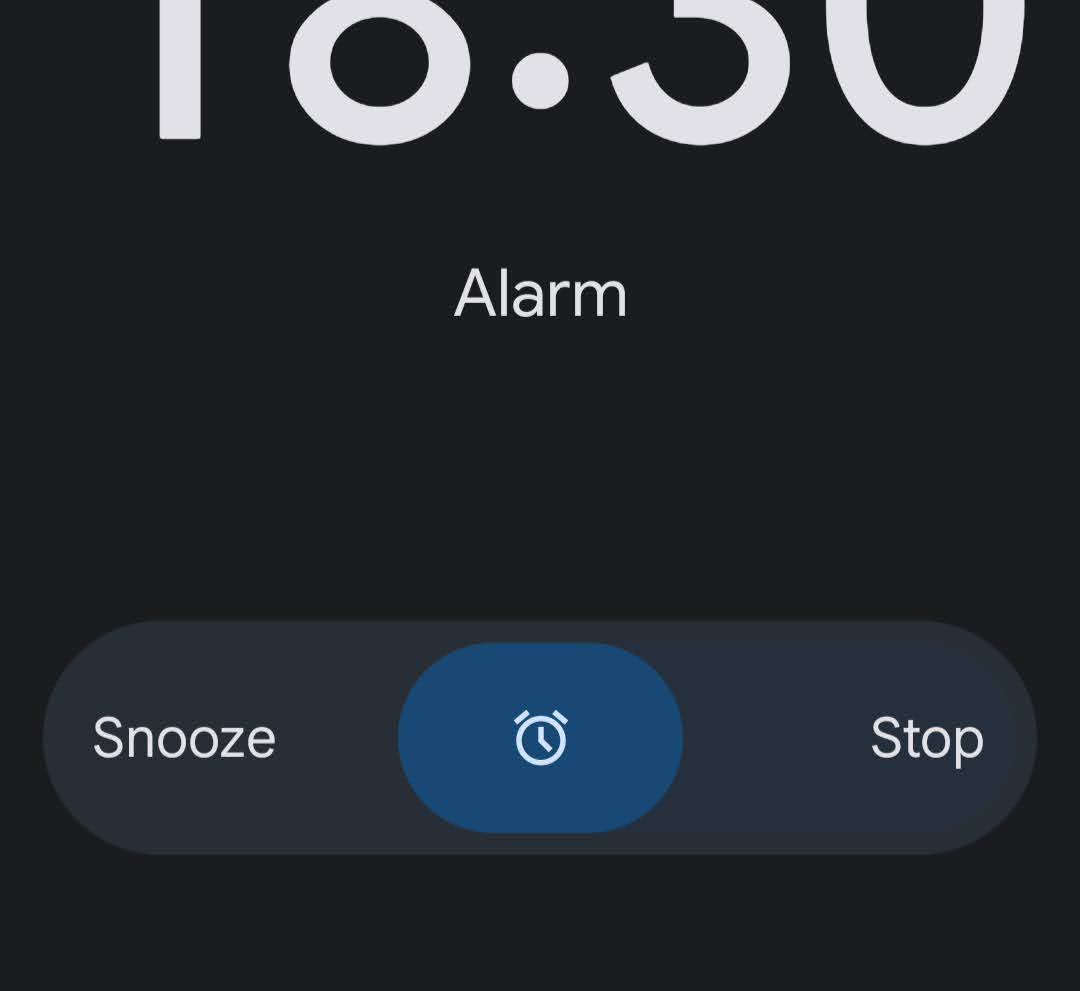
And yet, when the alarm goes off on my Pixel phone, a small bar at the bottom of the screen appears. On one side, in delicately small text, stands the word ‘Snooze’. On the other side, ‘Stop’. In the middle is some kind of bean that you have to drag to either one side or the other to activate either of those functions.
In making this design decision, you have placed the ‘Engine off’ button next to the ‘Begin inflight movie’ button in the airplane cockpit. You have placed an unlabeled jar of rat poison next to the unlabeled jar of salt in the pantry. You have put us all in danger, is what I am saying.
‘Snooze’ is the function on the alarm clock that turns the noise off just for a short while to let the person gently agonise in bed about the prospect of getting up and try to muster the momentum to do so by the time the noise starts again. The energy of ‘Snooze’ is ‘I am having a lovely sleep and am not quite ready to get out of bed, but very much need to get out of bed in roughly 10 minutes or there will be consequences.’
‘Stop’ is the function on the alarm clock that turns it off completely. The energy of ‘Stop’ is ‘I now, for a good reason, no longer need to be woken up – ideally because I am already up.’
THESE ARE TWO EXTREMELY DIFFERENT USE CASES, LADS.
Why would you put them so close to each other on the screen? Why would you make them look identical to each other? And why, indeed, would you make me do an escape room puzzle every morning by forcing me to figure out in which direction I need to drag the Special Bean in order to trigger one or the other of these features?? When woken forcibly, most people are not immediately able to think sharp and react precisely. They will simply grab their phone and shove their fingers against the screen until the horrible shouty wake-up noise stops. With the Android system, the system you have created, it is all too easy to do it wrong and accidentally turn your alarm off forever, allowing yourself to drift off into glorious repose until you wake again two hours later, startle violently when you see the time and go OH SHIT before diving into the bathroom to try to get ready for work in emergency mode.
In user interface design it is often the case that functions could be easily confused or accidentally triggered and cause something bad to happen. This is why user interface designers are supposed to think about this and make sure it is extremely unlikely. In a plane cockpit, they genuinely do put covers over buttons that you shouldn’t ever press by accident, such as the ‘evacuate’ button. In countless software programs, a dialog box opens and makes you click ‘OK’ to make sure you really want to delete something when you try to delete it. Even the ‘close’ and ‘minimise’ buttons on a window have obviously different colours to make sure you’re less likely to accidentally close a window when you just want to pop it out of view for a moment. This is not because the colours are pretty – it’s a crucial part of thinking about functionality.
There are also cases where user interface design is simply working to anticipate and prevent the kind of easy mistake that we all make when we’re not paying attention. ATMs only give you your cash after you remove your bank card because so many people otherwise take their money and stride confidently away while their card is poking out of the slot still, ready to be nicked by a passing scallywag.
The times when it is most important to think about these things are the times when the user is barely thinking at all. When users are in autopilot, everything has to be so intuitive that it is clear to the deepest caveman parts of a person’s subconscious what one has to do. And it has to allow for minor cognitive or hand-eye-coordination failures. At this point we should briefly shame the Apple Bluetooth keyboard, where the ‘lock screen’ button is positioned directly above the unusually slim ‘backspace’ button. This is the opposite of helpful. You misfire by a couple of millimetres when deleting a misplaced comma and lock your computer by accident, forcing you to enter your password and log back in. In failing to think about the kind of basic mistakes humans might make in moments of unawareness, designs like this are helping us make much worse mistakes.
But alright, you’ve stuck with your sliding-the-bean-from-side-to-side system, so the users can just learn to deal with it, right? Ah no, as it happens you have redesigned this feature multiple times over the years, each time with a new twist. Sometimes it is a bean in the middle that you have to drag somewhere; sometimes it is two beans on the side that you have to drag into the middle depending on your wishes. Sometimes it is two identical buttons that you simply have to tap. Sometimes it is a direction in which you have to swipe. Why do all of these feel like quick reaction minigames in Mario Party? Why do I have to figure out the answer to the riddle in an intimate personal moment when I am incapable of thought or reasoning? Why do you keep changing it and making me learn the choreography of this dance anew?!
The logic escapes me. Have you lot never had to catch an early-morning flight before? Did you never have to get the bus to school? Are you unaware of how much help and support people need simply to wake up when they really have to? There is a whole industry making novelty alarm clocks that roll off the table and hide, or make you solve a mathematical formula, or donate money from your bank account to charity, simply to make it harder for a person to unthinkingly turn off their alarm in the morning. You, meanwhile, are not paying attention to the basic requirements of the product.
Here’s what I’d do. Put the two buttons – ‘snooze’ and ‘stop’ – at the top and bottom of the phone screen and make them look completely different from each other. ‘Snooze’ can be big and round and red, while ‘stop’ can be a thin slide-toggle that you have to drag from left to right to fully activate. ‘Snooze’ will be at the bottom of the screen since that is closest to your thumb when you hold the phone – this is an important factor. And since we want to be certain that drowsy people are really, really sure that they’re no longer in need of the alarm, we will add a confirmation message to the ‘stop’ function: “Are you sure you want to turn off the alarm? [Yes]” In fact, we could even add that as an optional setting for the ‘snooze’ button as well, for the people who are always tempted to keep hitting ‘snooze’ until they’ve basically overslept anyway but have ruined their REM cycle in the process.
Right. That’ll be €150,000 please.