Something is growing on the banks of the Spree. Like a verruca it has been growing slowly, for many years, and as its size increases so too does the discomfort it is causing. This malignant infection is called the ‘Mediaspree’ and it is actually a large-scale property development project with the goal to build a skein of corporate buildings along the river in Friedrichshain, my neighbourhood. The buildings are diverse in style but ugly on an impressively consistent level, and the idea is that they shall house all kinds of media and telecom companies, thus invigorating the neighbourhood. And one of the most recent invigorations that has arisen out of this hot mess is the Amazon tower, which over the last several months has erupted out of the East Side Mall on the side of the Warschauer bridge with the jerky, staccato motion in which all tall buildings are built – like watching a timelapse of a cordyceps fungus bursting out of an ant’s head.
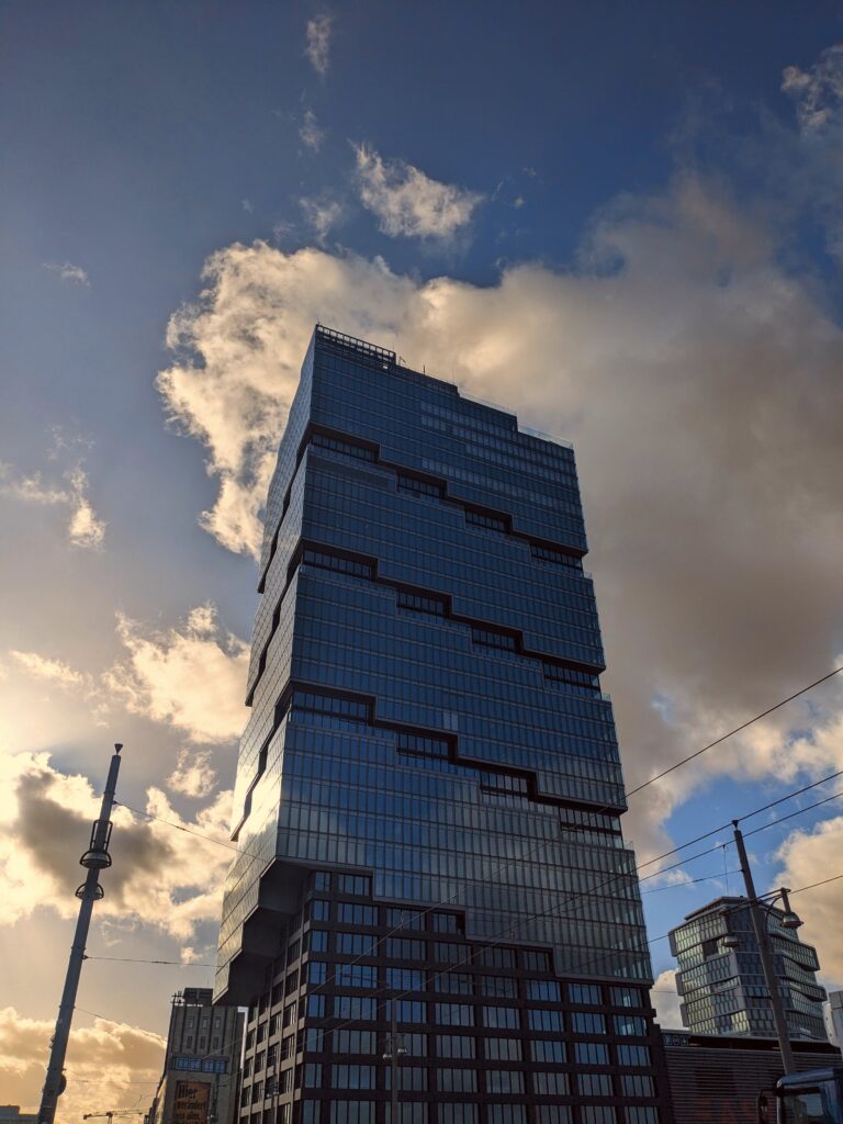
Now, I am not an architect, nor do I have enough knowledge of architecture or design to evaluate this building with any authority. However, what I do have is eyes, and that is all one needs to know that this building fails on every aesthetic and symbolic level. Let’s take a look at it and then dive right into the analysis.
First impressions: it’s a big, evil phallus. I probably didn’t even need to point that out. It is extremely frustrating that it is not even trying to be a fun, creative phallus. London has all kinds of blobby, goofy buildings that immediately inspire some kind of amusing nickname: the Gherkin, the Walkie-Talkie, the Testicle. And the best they could give us in Berlin was another big rectangle. What, Jeff Bezos, no curves? No skewy-warpy bits? No sci-fi vibes? Don’t you have half the world’s money, Jeff Bezos? Couldn’t you splash out on a bulge or two, Jeff Bezos?
One of the chief problems with this building is its visual weight. By which I mean: it looks like a colossal slab pressing down on the world. To look at it is to feel oppressed by a looming threat, a sharp black Jenga tower which will pulverise humanity when it topples over. It squats in the middle of the sky as if it actively wants to block out the sunlight and keep you in the cold shade. A lot of skyscrapers these days are built to feel airy, fluid, sleek. The Amazon building is none of those things. It looks like a desktop PC that was blindly dumped in the middle of a Playmobil village. Why did you want this, Jeff Bezos?
If it isn’t bad enough that the building looms over you with its uncompromising heft, an additional feature is the overhang on the left side, which is the side that faces the street. Pedestrians now must cower under a blocky, black overhang that barges into the top of your peripheral vision – the part where clouds and birds should be. When you look up it feels like the whole thing might fall on you at any moment and crush you into a coulis. It gives the building an uncouth, caveman forehead; an asymmetrical flange creating the illusion that it is leaning. Did you like this idea, Jeff Bezos?
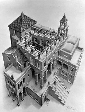
By now you will have noticed the central design motif of the building, which is this odd stepped stripe thing that repeatedly cuts through the surface of the dark, lifeless glass. What is this pattern? Is it supposed to be chevrons? Clearly not, because modern architecture is capable of creating clean, sharp chevrons in glass and steel; if that was the plan it would not need to be chunky and pixellated like this. Is it meant to look as janky as it does? The shape is uneven and misaligned, there are thin bits and thick bits, it looks like the outlines were drawn with Microsoft Paint. Yet in a sense it does not matter what it is meant to be or resemble, because the actual image this building accidentally creates, the motif we subconsciously register when viewing this contextless structure, is clear: it is an Escherian staircase.

This endless, aimless staircase wraps around the Amazon building over and over again, showing the people outside and the people inside that the grind is eternal and always uphill. The bleakest metaphor for human effort, plastered on a big glass effigy to capitalism and consumption. I mean, it’s a perfect fit, Jeff Bezos, but did you have to make it that obvious?
At night, the building is dark. An occasional fluorescent tube light beams through a single window, and the bottom flange is lit by feeble spotlights, but the building at large is unilluminated. At dusk it is therefore nothing but a big black middle finger jutting out of the quirky, ramshackle skyline of Friedrichshain. Its shadow is an enormous, flat, black bar without flair or dimension – as if part of the sky was accidentally deleted. A skyscraper should have a sense of drama and cosmopolitan excitement, it should be imposingly aspirational during the day and a gleaming sword to the heavens at night. This is just a lump. Are you proud of your lump, Jeff Bezos?
One final thing, Jeff Bezos. The sculpture. In front of the Amazon Tower there is a piece of ‘art’: a 23-metre-tall block of black concrete with a shopping cart half-embedded in it at the top. Like the tower, this too looms over the innocent people who are just trying to enjoy their free time with as little dystopian dread as possible. This ‘art’ is doing its best to prevent that. Firstly: it is in the way. It is blocking people’s path to the places they are trying to get to. Secondly, it is a shopping cart stuck in concrete. What narrative are we meant to read here? Is it about the entrapment of the human mind in consumer culture? Is it about placing consumerism on the highest possible pedestal, enshrining it there permanently, unable to be dethroned by the hand of the common man? Why are you confronting us with such bleak imagery once again, Jeff Bezos? And, Jeff Bezos, did you realise that this ‘art’ could also be read as a gravestone, signalling the death of Big Shopping? It is a shopping cart STUCK IN CONCRETE. Its progress is forever halted; it will never be wheeled along an aisle, never filled. It looks stupid, it is at a wonky angle, it (consumerism?; perhaps Amazon itself?) is not willing to admit that it is weak and laughable. Many people have vandalised and thrown paint on this ghastly concrete block. People don’t like it. People don’t like the tower, either. The tower tells us without words everything we need to know about you, Jeff Bezos. Maybe in that way it is a huge success. Just a shame, really, that it’s in our lovely neighbourhood. Is there anyway it could be relocated – to up your arse, perhaps?


