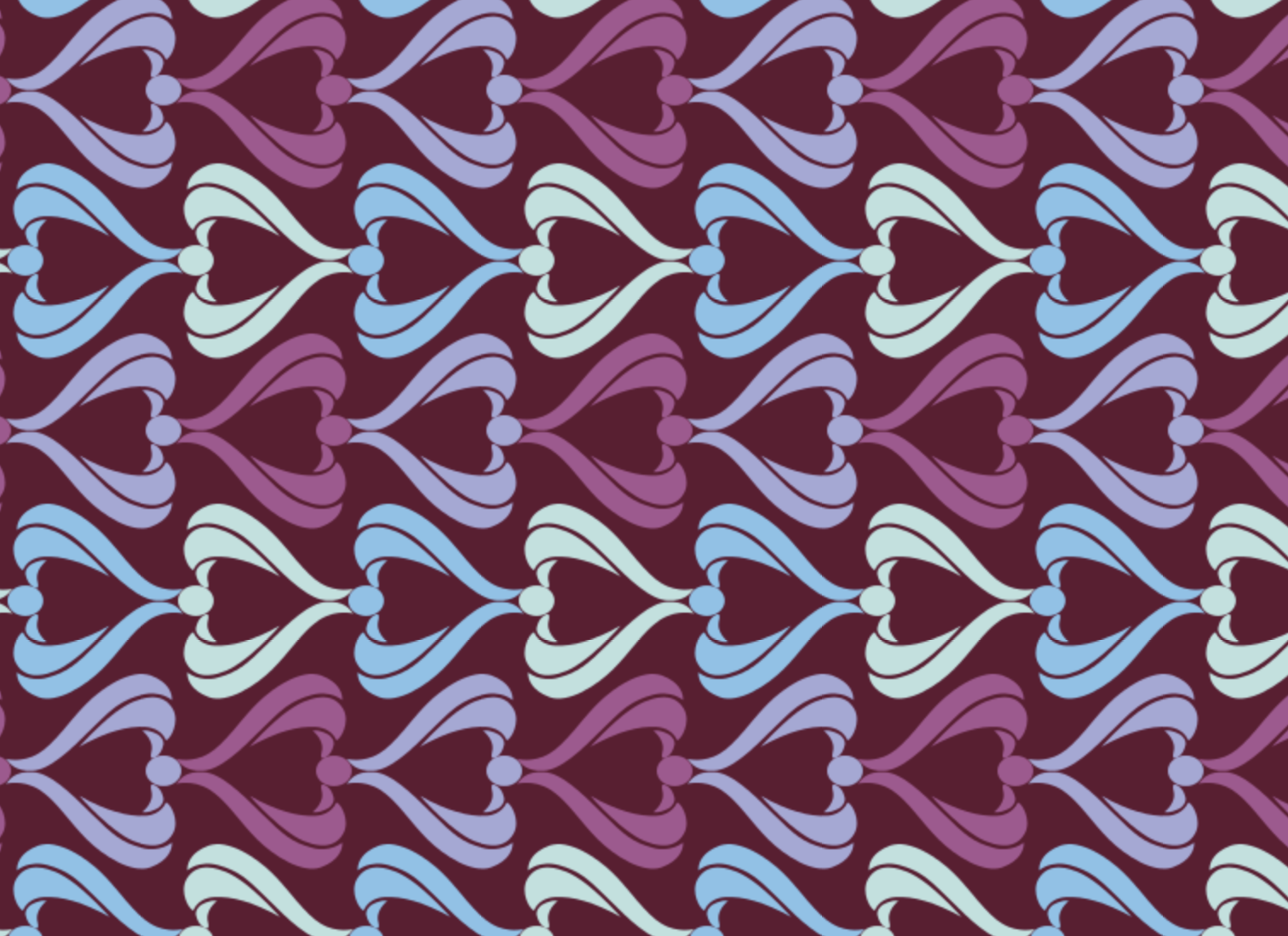
Hideous pattern crime courtesy of colourlovers users SleepyUsagi & canopygallery
Bike shopping makes me nervous. I do not like looking at all the beautiful, fiendishly cool machines that my heart yearns for but I could never afford. I do not like how the small bikes for teenagers leer at me from the edge of the store, whispering that they are probably more likely to fit my puny stunted body than the adult bikes. I do not like the mild, nagging fear that whichever bike I choose will seem fantastic in the shop but will turn out to be the completely wrong choice the moment I leave the shop and accidentally scratch the paintwork, rendering it completely unreturnable. But most of all there is one thing I very much do not like.
For this shopping session, for example, I was in the market for a gravel bike. The shop man was helpful and showed me a couple of models that he thought might suit my diminutive stature and I did a test ride with one that seemed really nifty: light aluminium frame, cool chunky tires, racing handlebars aggressive enough to suit my persistent rage-energy. It was a dark burgundy colour because LADY BIKE, and when I pulled the brakes I noticed that there was a delicate squirly pattern on the top of the frame in a slightly paler burgundy. Flowers printed among the squirlies. And in the same colour, in all caps, the word CONTESSA. Disgusted, I immediately discarded the bike and put the manufacturer on my ‘no’ list.
Contessa. As far as aristocratic feminine nicknames go, it’s the classy continental version of ‘duchess’, the grown-up version of ‘princess’. For the sporty, outdoorsy gal who loves to speed along rough country tracks and take daring offroad shortcuts with mud licking up her legs – but also wants to feel like an elegant dame parading delicately along the promenade in a brocade gown. Just for contrast, the men’s version of this bike was egg yolk yellow and called the ‘Speedster’. I am so tired.
For one thing, it’s important not to forget that women’s bikes are stupid in general because the vast majority of them are made with the ‘trapeze’ frame shape, with a slightly lower top bar. Why is this? Well, to ensure that women can get on and off the bike in a more elegant manner, i.e. without having to swing their leg over and look undignified. THIS IS A TRUE FACT. STILL. IN THE YEAR 2023. Don’t forget to maintain your dignity, babes! For if women have to raise a leg too high things (knickers) may be revealed (flashed) and reputations would be permanently ruined.
But with this bike what sticks in my throat is not the gendering of the bike per se, nor the Mills-and-Boony ‘CONTESSA’ nomenclature, cringe though it may be. What bothers me the most is how shit the bike looked. Mud-coloured flowers on a background of wine stain. I would have minded less if the bike had been neon pink with glittery stars and lipstick-kisses all over it; in fact, that would have been quite fabulous. I would have been completely on board if the bike had had a pattern of adorable kittens all over the frame. But they couldn’t even be bothered to make it girly. They just had to make it feminine in the most perfunctory, drabbest, most lacklustre way. I have decided this aesthetic needs a name. I have decided to call it ‘femibland’.
We need the word ‘femibland’ because femibland stuff is fucking everywhere and it all needs to be heaped into an extremely large pile and set on fire. Women have gone through enough shit without having to put up with this kind of aesthetic. The femibland look is easy to recognise: if something is dull-looking, pragmatic, with nary a hint of personality to it whatsoever, but rather than just leaving it at that, whoever designed the thing has added a touch – the most basic, uninspired, lowest-common-denominator signifier of ‘THIS IS FOR GIRLS’ – just to make sure no one was in any doubt as to which gender should be using this item.
Here are some examples. I recently went skiing, and the skis that the rental shop gave me were extremely femibland. They were brown with black accents but JUST TO MAKE SURE that they couldn’t be confused for unisex skis, a delicate pattern of feathers had been placed in a strip along the center. The femibland aesthetic is absolutely rife in fitness- and sportswear. A pair of running shoes for men will be black and grey; a pair of running shoes for women will be black and grey but there will be a purple flourish along the side. A women’s workout top will be a decent, functional piece of clothing with no other remarkable style elements but will have an embroidery of a butterfly on the shoulder.
This is a cornerstone of the femibland stylebook. If an item of clothing is perfectly fine and generic as it is, all you need to do is embroider something that screams ‘uterus haver’ asymmetrically somewhere on the garment. We can observe this being used to great effect in the pajama and sleepwear department. A soft, grey dressing gown? Nice, but can we embroider a heart on the lapel? A bow? Or maybe Snoopy? Snoopy is an excellent motif for the femibland aesthetic because he is cute and instantly recognisable but also an exquisitely bland character from a cartoon that no one has actively engaged with for several decades, so no one has any opinions about him whatsoever other than ‘oh, it’s Snoopy’. It’s a bonus for femibland clothing to have this embroidered accent in the same colour as the fabric so it’s only just visible as the texture and sheen of taut stitching – ideally, the styling of this piece should be so unopinionated and mild that we don’t even want contrasting colours if we can avoid it.
Imagine this for men. Imagine if every other garment for men had an electric drill or a barbeque or a Ferrari embroidered in muted tones on the chest. Men don’t have to worry about this because men’s stuff doesn’t need an embroidered touch, men’s clothing is too busy being excellent. Men’s stuff is made of lovely, high-quality fabrics with all kinds of jazzy colours ranging from sporty neons to lumberjacky forest tones to the luscious tropical palettes of hawaiian shirts. Men’s sports stuff is pragmatic, in black and grey and charcoal, but can also be electric-blue, earthy-green, emergency-orange.
Pink is the classic colour for women’s stuff, with purple a willing understudy. This is too obvious, too blunt, too uncouth for the femibland aesthetic. Femibland stuff aims to avoid the obviousness of using pink or purple as the base colour, because this would be too girly and have a personality. No – femibland design is about gesturing vaguely towards feminine tropes without running the risk of actually going full pixie. Therefore, femibland stuff typically relies on grey as the base colour. Beige, greige, burgundy and sadness-brown are also acceptable. A femibland item needs to look like the item itself is menopausal; it is tired, grumpy and a little damp from the sweating caused by the occasional hot flush. The ideal femibland item is grey with pale pink spirals, fleurs-de-lis or hearts draped artfully across it somehow. It must gesture at the soft and the romantic, but chiefly it must be generic, unstimulating, practical.
Yes, practical. Femibland stuff is designed to be basic, functional and ergonomic. But IMPORTANT: we are not talking about functional or ergonomic in the sense that men’s stuff is functional and ergonomic. Men’s stuff is functional in a really involved, active way; there are features on every face of the product that have some kind of use or purpose. Hey, a pair of cargo trousers with a million pockets and a carabiner clip and reflective strips on the back pocket flaps! Woah, a winter jacket that has a hidden inner compartment and a removable thermal lining and a retractable elastic pulley clip mechanism thing so you never lose your keys! This is too intense for the femibland playbook. Women don’t really do anything, so we don’t need features or functions or cool extra belt loops for a swiss army knife. ‘Practical’, in the sense of women’s products, is always a reductive energy, striving towards the bare minimum; in men’s products it is a constructive energy, a maximalist effort to solve problems by adding solutions.
I am boycotting femibland products and I urge you to do the same. If you are in a situation where you feel it is unavoidable to purchase something femibland, take a moment to move across the aisle and see whether the men’s section offers the thing you are looking for in a better, cooler, funkier and higher-quality version. Don’t let the designers dictate your taste just because they have decided that grown women’s taste should be frumpy and suffused with an aching ennui. Resist the grey; leave the swirlies in the store. Embody the speedster, not the contessa.